Page 1 of 1
Another flower shot... part 2!
Posted: Tue 22 Jul 2014, 17:55
by Paul Heester
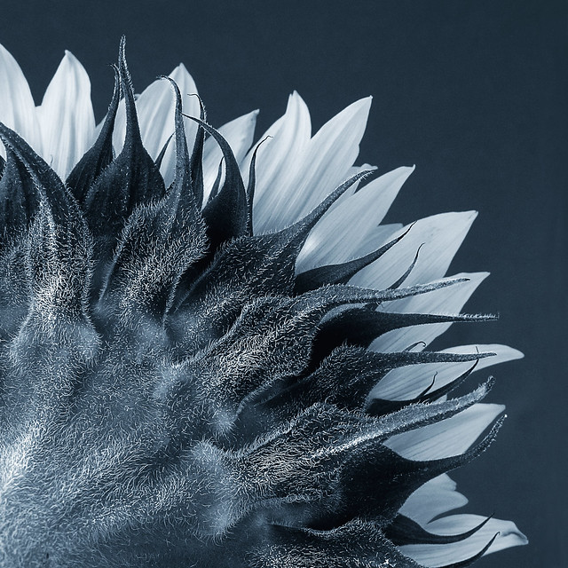
Bought some Sunflowers recently and spent a morning taking many shots of them. Was attracted to the hairs on the back and thought a duotone treatment would bring out the detail. Prior to the duotone I used the B&W conversion tool to add contrast to the flower. Some mild dodging was involved on the "hairs" and then went for a square crop. EXIF was f/11 @ 1/3s, ISO 400 with +0.7EV. Setup was in my dining room with window light, reflector, tripod and blue background sheet all used.
 Sunflower study
 by
Paul Heester, on Flickr
Re: Another flower shot... part 2!
Posted: Wed 23 Jul 2014, 03:00
by davidc
Saw this on flickr and I like it. The duotone works well IMO and hides the fact it's a sunflower and made me look at it closer before I realized what it was.
If I was to offer a tweak suggestion it'd be to crop it slightly on the left, the very centre isn't as sharp as the rest and I'd try to get the left vertical edge of frame cutting through one of those sunflower leaves (if that makes sense?)
Otherwise I like the effect.
edit - forgot to add, I'd have a little more negative space on the right. Not a huge amount mind

Re: Another flower shot... part 2!
Posted: Wed 23 Jul 2014, 05:23
by Nina
I enjoyed this one. Detail is great and I like the composition too, but like David I would remove the area on bottom left one way or another, it is too bright and less sharp then the rest. I would probably settle for B&W here as the blue doesn't do much for me. Hope this helps.

Re: Another flower shot... part 2!
Posted: Wed 23 Jul 2014, 07:47
by Paul Heester
davidc wrote: If I was to offer a tweak suggestion it'd be to crop it slightly on the left, the very centre isn't as sharp as the rest and I'd try to get the left vertical edge of frame cutting through one of those sunflower leaves (if that makes sense?)
Nina wrote:I enjoyed this one. Detail is great and I like the composition too, but like David I would remove the area on bottom left one way or another, it is too bright and less sharp then the rest. I would probably settle for B&W here as the blue doesn't do much for me. Hope this helps.
Very good suggestions on the crop and something Ive only just seen myself.
Re: Another flower shot... part 2!
Posted: Wed 23 Jul 2014, 08:48
by Mike Farley
Both Nina and davidc have pretty much summed up my views. The backs of some flowers can often be as interesting as their fronts when shown in a more abstract way by going in close.
Re: Another flower shot... part 2!
Posted: Wed 23 Jul 2014, 09:39
by Paul Heester
Have updated my shot now, based on the comments.
 Sunflower study
 by
Paul Heester, on Flickr
Re: Another flower shot... part 2!
Posted: Wed 23 Jul 2014, 10:32
by davidc
I definitely think it's better - where I suspect I'll disagree with the others is I'd add more space to the right hand side but then again my personal preference for not liking extreme cropping is well known

Re: Another flower shot... part 2!
Posted: Wed 23 Jul 2014, 13:13
by Mike Farley
Certainly an improvement, although the lower left hand side could do with toning down and I might be tempted either to crop a fraction harder or use the cloning tool to remove the small area of petal at the the top left edge. Sunflowers have warm colours, so the cooler blue toning still seems at odds with the subject.
Re: Another flower shot... part 2!
Posted: Thu 24 Jul 2014, 06:29
by davidc
Mike Farley wrote:I might be tempted either to crop a fraction harder or use the cloning tool to remove the small area of petal at the the top left edge.
Curious, not sure which bit you mean here? I think that cropping through the centre of the petal makes it look more symmetric and quite deliberate?
Re: Another flower shot... part 2!
Posted: Thu 24 Jul 2014, 07:53
by Mike Farley
It's a minor point, although it would probably get picked up by some judges. It removes a small area of light tonality from the edge of the image.